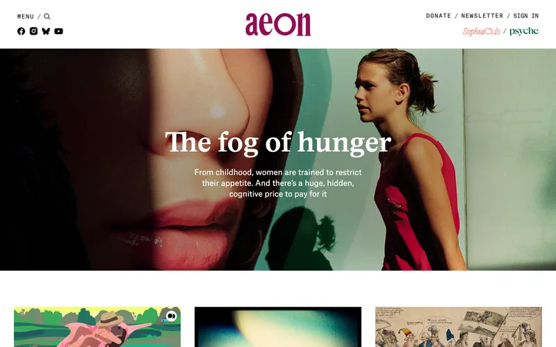
74% match
Similar because both use light, airy interfaces and high-contrast typography, both are Media sites, and both target Readers and Designers.
From calm.com
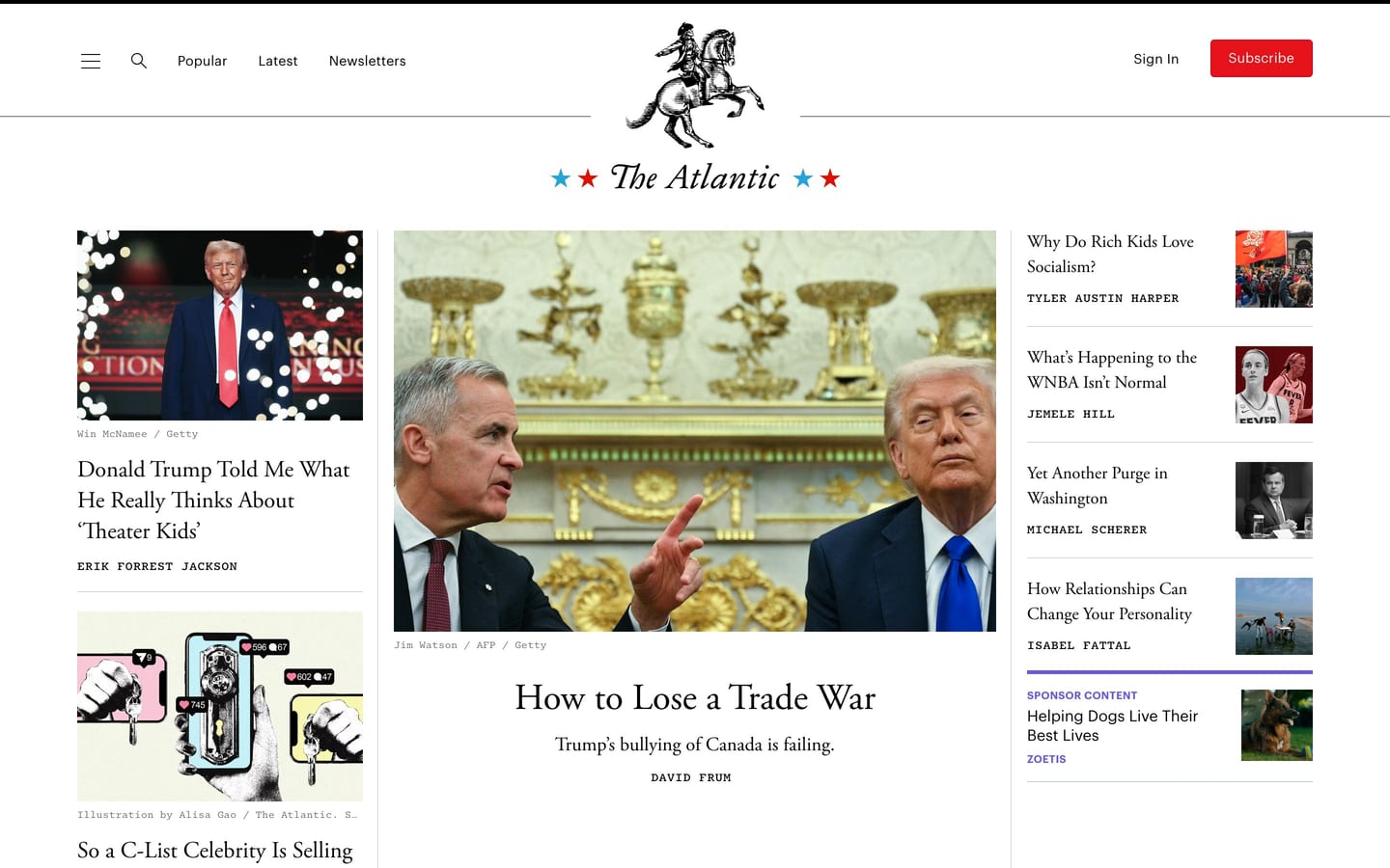
theatlantic.com
The Atlantic covers news, politics, culture, technology, health, and more, through its articles, podcasts, videos, and flagship magazine.
https://theatlantic.com/
Similar because both use light, airy interfaces and high-contrast typography.
Product-facing similarity scores, not statistical measurements.
A balance of how it looks and what it is.
Similar because both use light, airy interfaces and high-contrast typography, both are Media sites, and both target Readers and Designers.

Similar because both use light, airy interfaces and a consumer aesthetic, both are Media sites, and both target Readers and Designers.
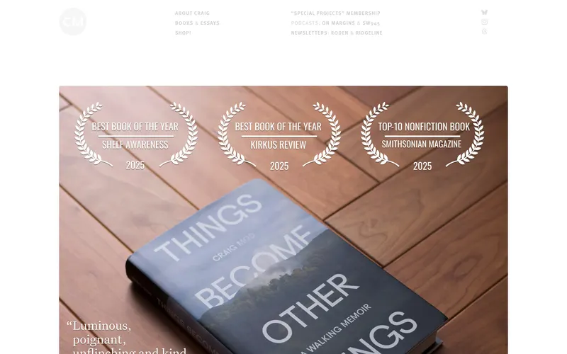
Similar because both use light, airy interfaces and high-contrast typography, both are Media sites, and both target Readers and Designers.
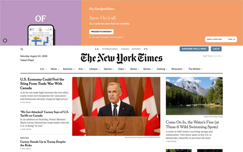
Similar because both use high-contrast typography and a consumer aesthetic, both are Media sites, and both target Readers and Designers.
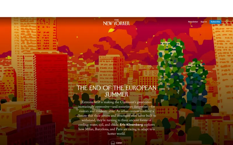
Similar because both use a broad consumer audience and a consumer aesthetic, both are Media sites, and both target Readers and Designers.
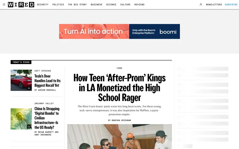
Similar because both use light, airy interfaces and a broad consumer audience, both are Media sites, and both target Readers and Designers.
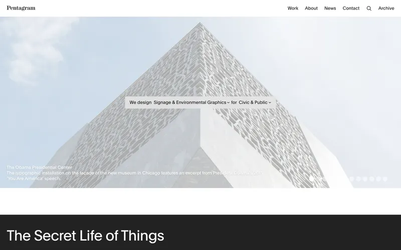
Similar because both use a broad consumer audience and a consumer aesthetic, both are Media sites, and both target Readers and Designers.
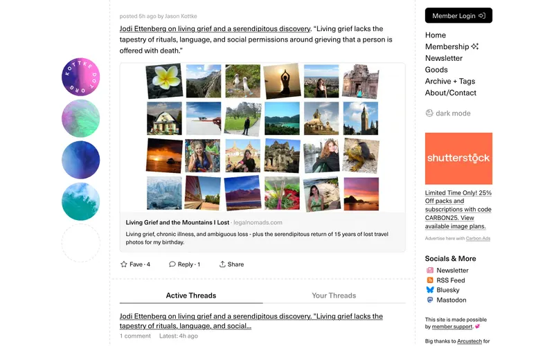
Similar because both use a broad consumer audience and high-contrast typography, both are Media sites, and both target Readers and Designers.

Similar because both use light, airy interfaces and a broad consumer audience and both target Readers and Designers.
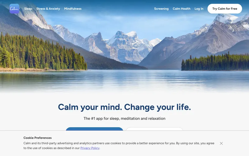
Similar because both use light, airy interfaces and high-contrast typography.

Similar because both use high-contrast typography and a consumer aesthetic and both target Readers and Designers.

Similar because both use light, airy interfaces and a consumer aesthetic.

Similar because both use light, airy interfaces and high-contrast typography.
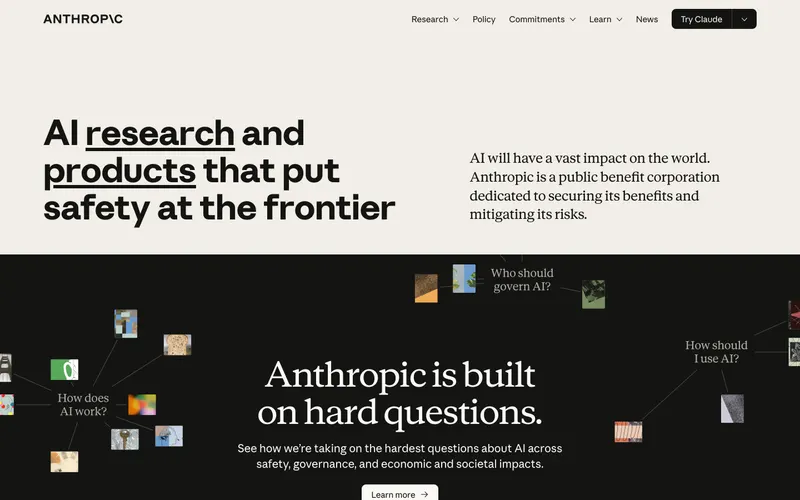
Similar because both use light, airy interfaces and a consumer aesthetic.

Similar because both use a broad consumer audience and light, airy interfaces.

Similar because both use a light aesthetic and a editorial aesthetic and both target Readers and Designers.

Similar because both use a consumer aesthetic and a light aesthetic.

Similar because both use a consumer aesthetic and a light aesthetic.
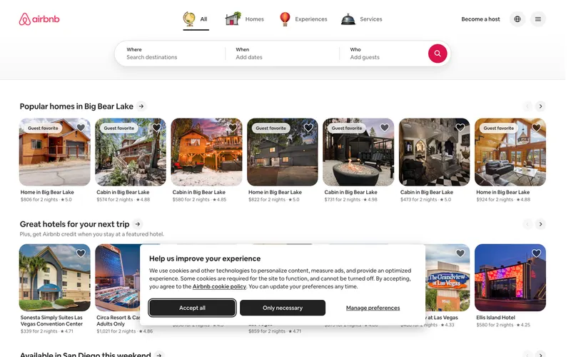
Similar because both use light, airy interfaces and a consumer aesthetic.
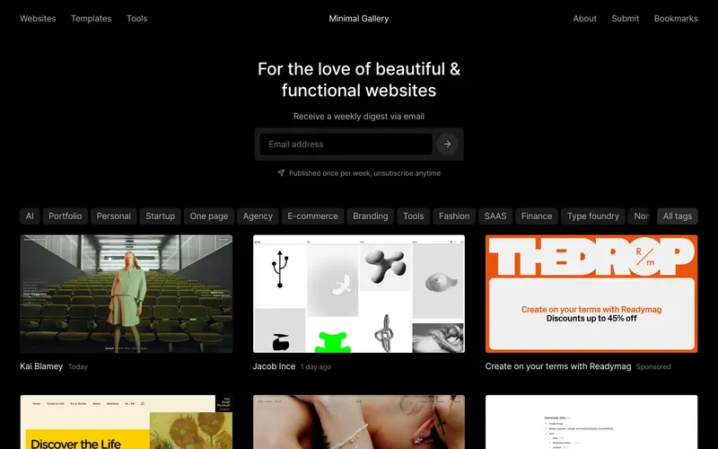
Similar because both use light, airy interfaces and a light aesthetic and both target Readers and Designers.

Similar because both use a consumer aesthetic and a light aesthetic.
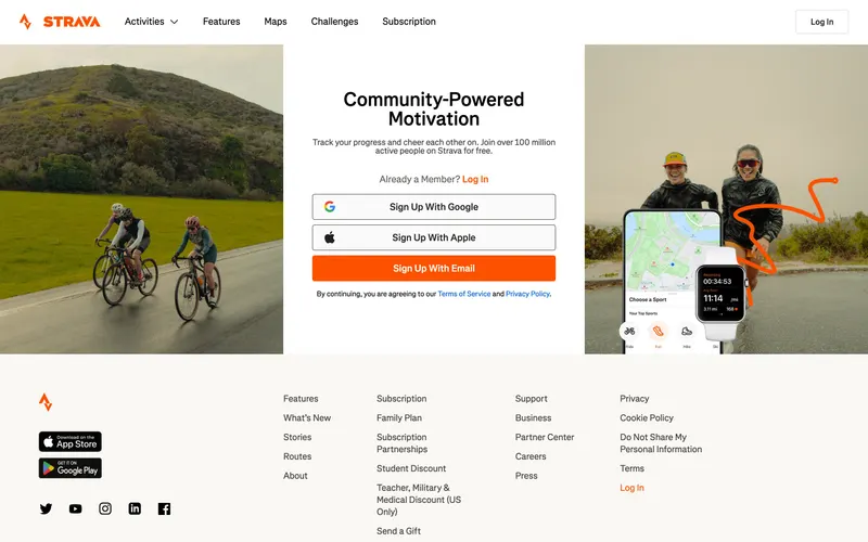
Similar because both use high-contrast typography and a consumer aesthetic.

Similar because both use a consumer aesthetic and a light aesthetic.

Similar because both use high-contrast typography and a consumer aesthetic.