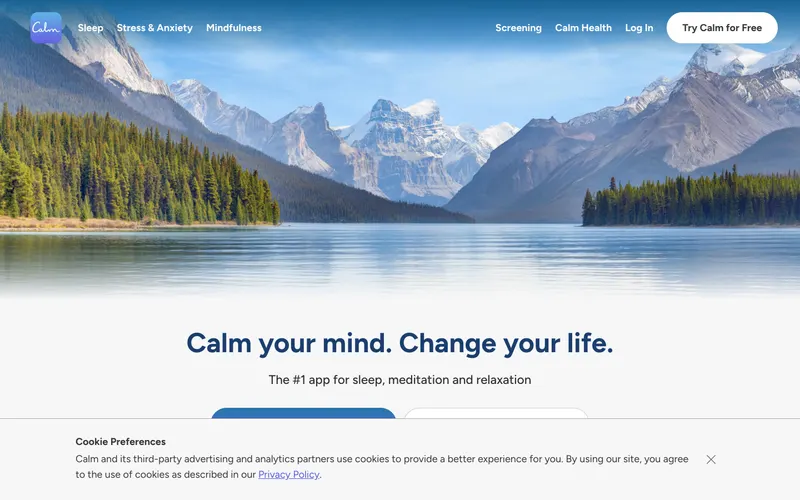
70% match
Similar because both use high-contrast typography and a consumer aesthetic and both are Education sites.
From minimal.gallery
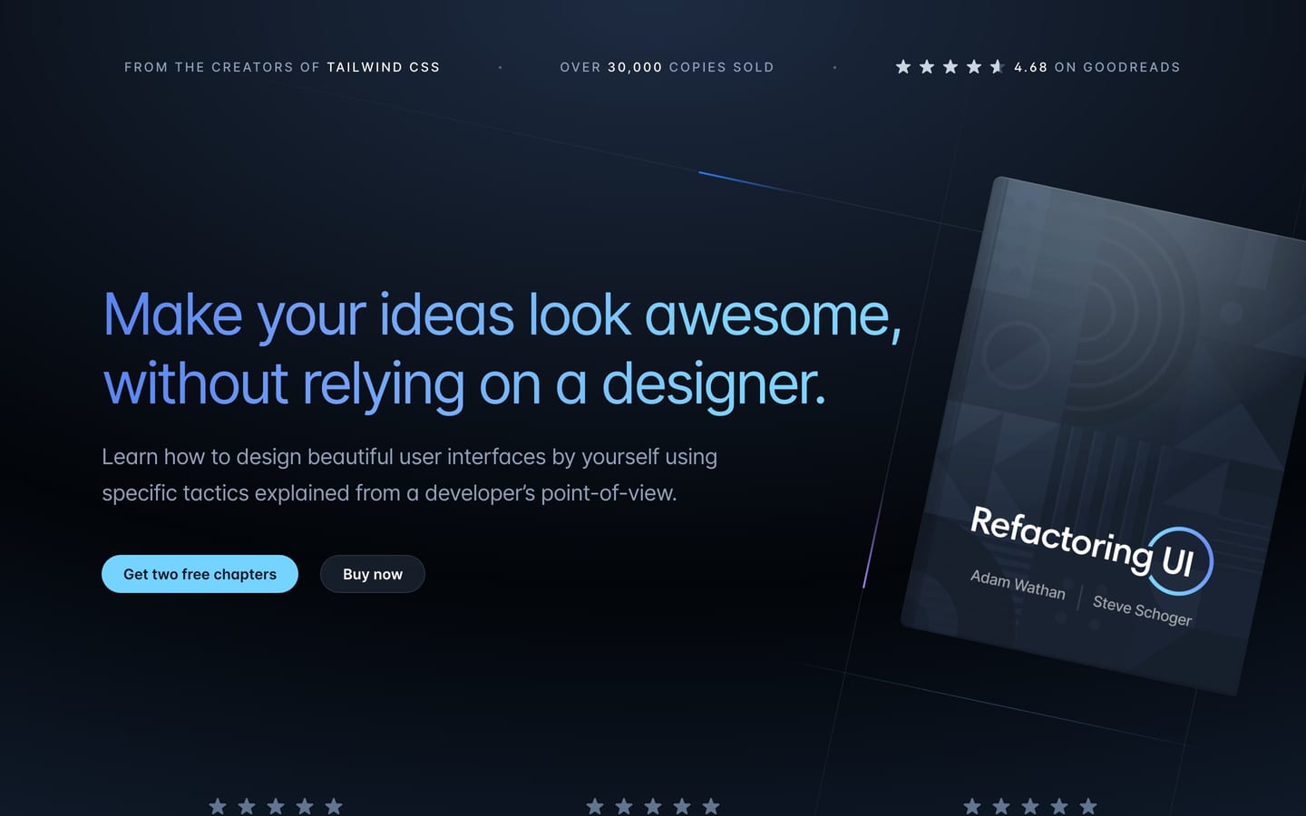
refactoringui.com
Learn how to design awesome UIs by yourself using specific tactics explained from a developer’s point-of-view.
https://refactoringui.com/
Similar because both use a light aesthetic and a editorial aesthetic and both target Readers and Designers.
Product-facing similarity scores, not statistical measurements.
A balance of how it looks and what it is.
Similar because both use high-contrast typography and a consumer aesthetic and both are Education sites.
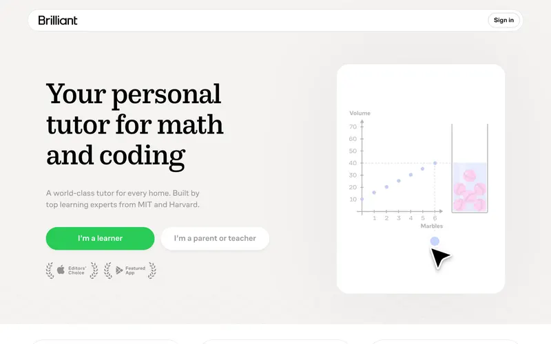
Similar because both use a consumer aesthetic and a light aesthetic, both are Education sites, and both target Readers and Designers.
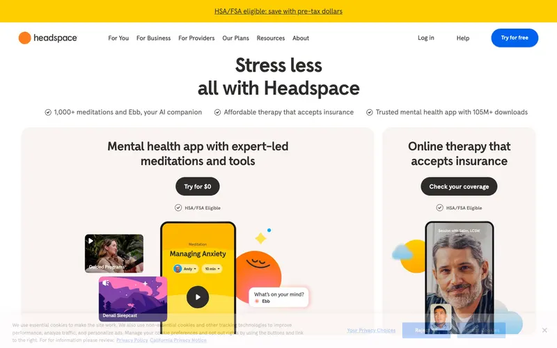
Similar because both use a consumer aesthetic and a light aesthetic and both are Education sites.
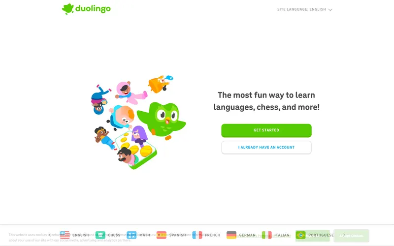
Similar because both use high-contrast typography and a consumer aesthetic and both are Education sites.
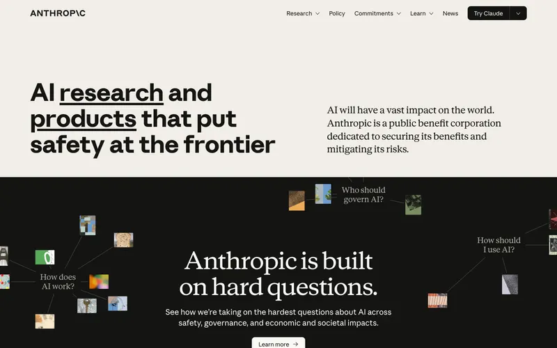
Similar because both use a consumer aesthetic and a light aesthetic and both are Education sites.
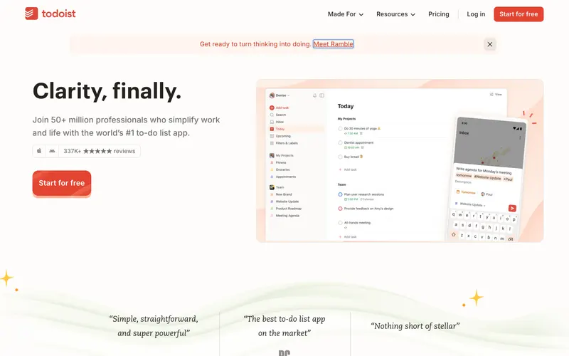
Similar because both use a consumer aesthetic and a light aesthetic.

Similar because both use high-contrast typography and a consumer aesthetic.
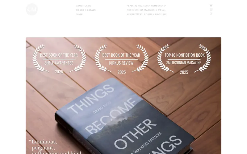
Similar because both use high-contrast typography and a consumer aesthetic and both target Readers and Designers.
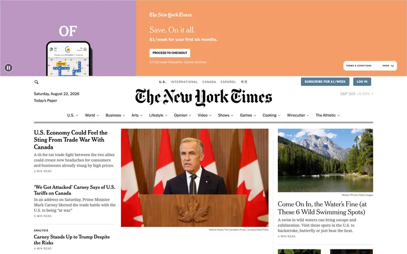
Similar because both use high-contrast typography and a consumer aesthetic and both target Readers and Designers.
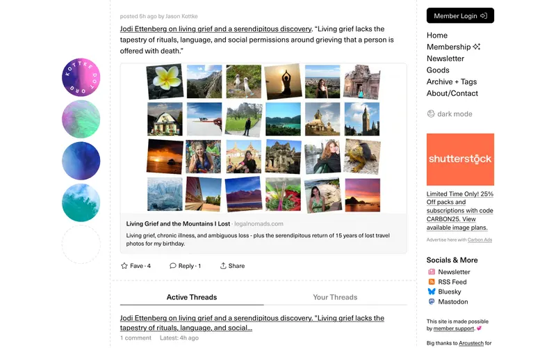
Similar because both use high-contrast typography and a consumer aesthetic and both target Readers and Designers.
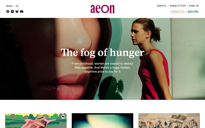
Similar because both use high-contrast typography and a consumer aesthetic and both target Readers and Designers.
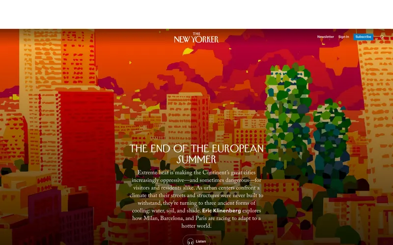
Similar because both use a consumer aesthetic and a light aesthetic and both target Readers and Designers.
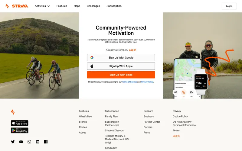
Similar because both use high-contrast typography and a consumer aesthetic.
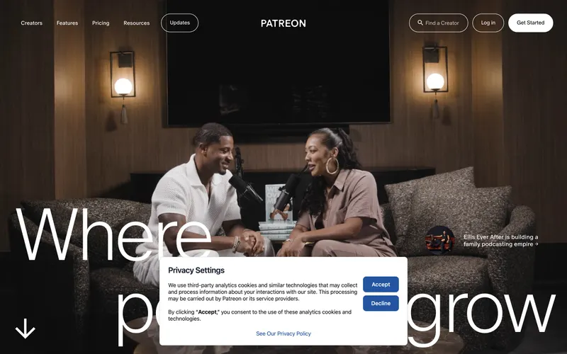
Similar because both use a consumer aesthetic and a light aesthetic.

Similar because both use high-contrast typography and a light aesthetic and both target Readers and Designers.
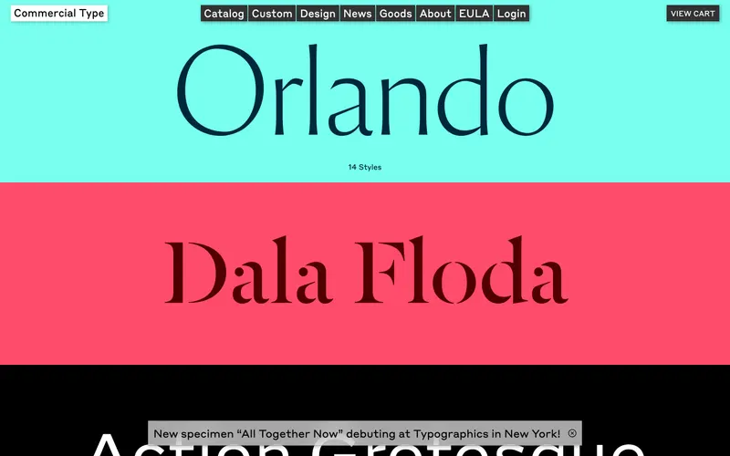
Similar because both use a consumer aesthetic and a light aesthetic.
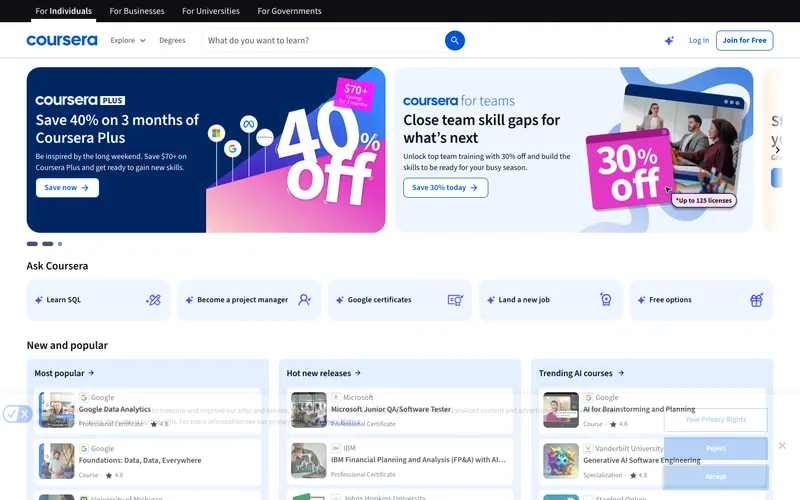
Similar because both use a consumer aesthetic and a light aesthetic.
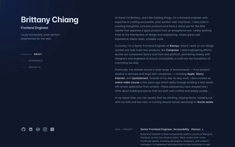
Similar because both use a consumer aesthetic and a colorful aesthetic.

Similar because both use a consumer aesthetic and a light aesthetic.
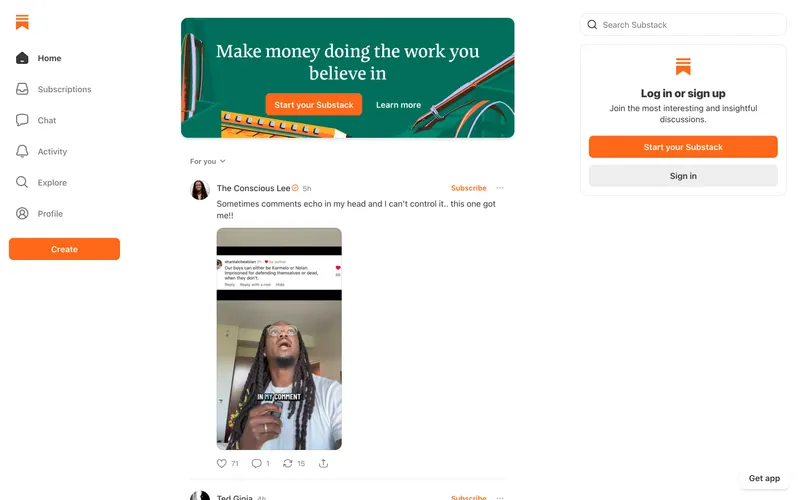
Similar because both use high-contrast typography and a consumer aesthetic.
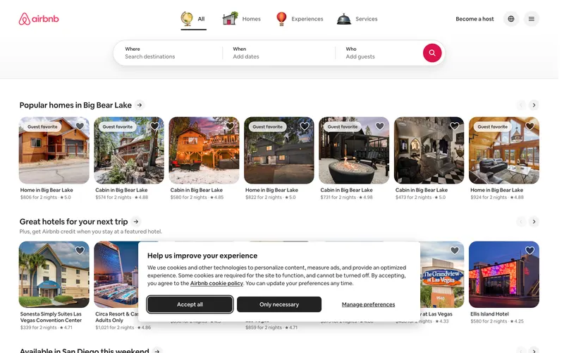
Similar because both use a consumer aesthetic and a light aesthetic.
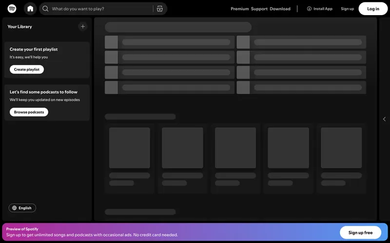
Similar because both use high-contrast typography and a consumer aesthetic.
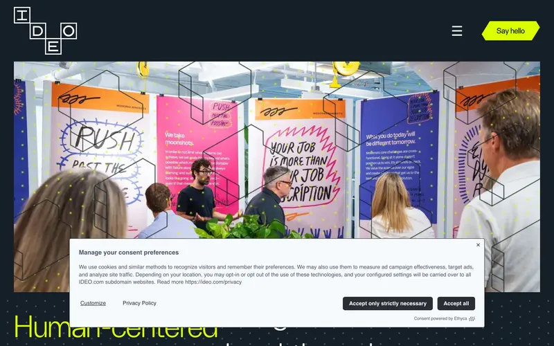
Similar because both use high-contrast typography and a light aesthetic.
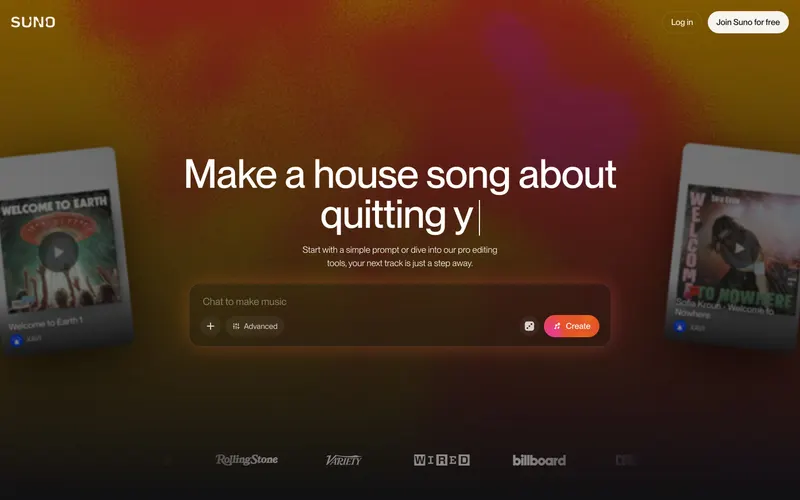
Similar because both use a consumer aesthetic and a colorful aesthetic.